5 e-Commerce UX Design Trends of 2016
- eCommerce
- UX
- Web Design
UX design in the world of e-Commerce is forever changing, providing a constant challenge for web designers who must constantly assess the current trends and stay ahead of the competition to ensure the customer is delivered a seamless shopping experience.
Here’s a look at some of my current favourite e-commerce design trends.
1. Large Backgrounds
Customers love images, not text, and can be put off by too much information. It will no doubt lead them to focus on the pictures if they don’t have time to read. A key factor in a customer’s purchase decision is in their initial impression whilst browsing your store.
Large pictures and video backgrounds create beautiful engaging websites. They can encourage potential customers to make a purchase the moment they arrive on your website. E-commerce stores use this technique extensively to create a clean, professional look and make their products more desirable.
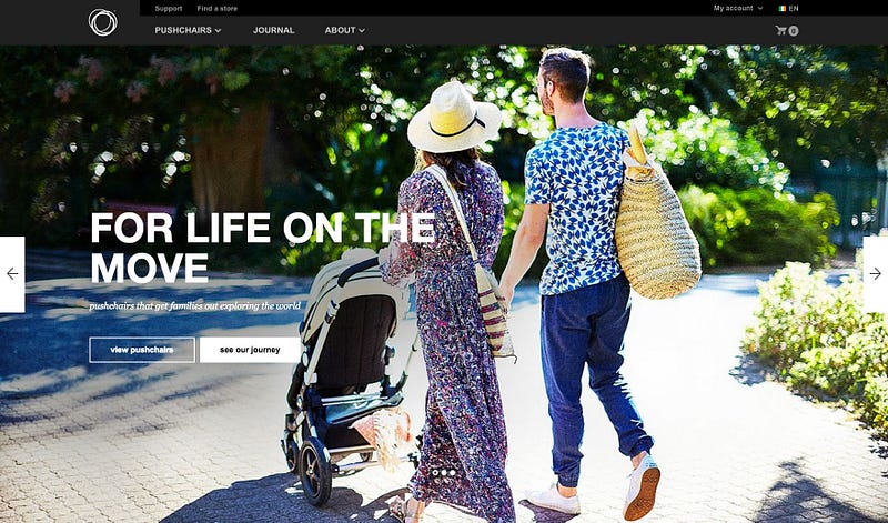
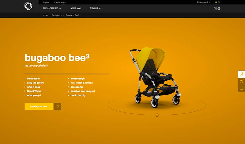
The use of large backgrounds doesn’t need to be limited to the home page. Implementing them on product pages with interactive images and videos can be a great way to improve the shopper’s experience on your site. This is how Bugaboo have implemented this feature.
2. Responsive Typography
Typography is a major part of developing a brands visual identity and attracting shoppers towards products within the online store. With more and more users consuming content via mobile devices, responsive typography has become a great asset in allowing large text designs to maintain a consistent look across all size devices.
Responsive typography allows the font size to change relative to the viewpoint. It is best used on headings that need to stay consistent in its environment.
Whereas non-responsive typography allows the text to break based on where the edge of the container sits and is more relevant to body copy where a sentence can span across as many lines as it needs on any screen size.
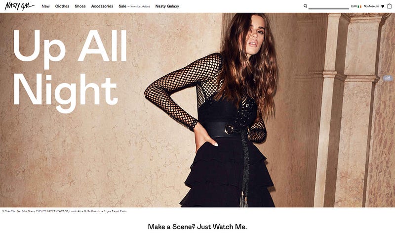
See how Nasty Gal has implemented large, flexible typography simply and effectively.
3. Hidden Menus
Over the last few years, minimalism has continued to be one of the most consistent web design trends, focusing on clean, simple and easy to navigate aesthetics and giving prominence to imagery and large backgrounds.
Many designers believe that the hamburger icon has achieved universal status and brands should no longer be afraid to hide their navigation as users associate the icon with being a menu or list and will interact with it.
One of my personal favourite websites to find an example of this is EtQ.
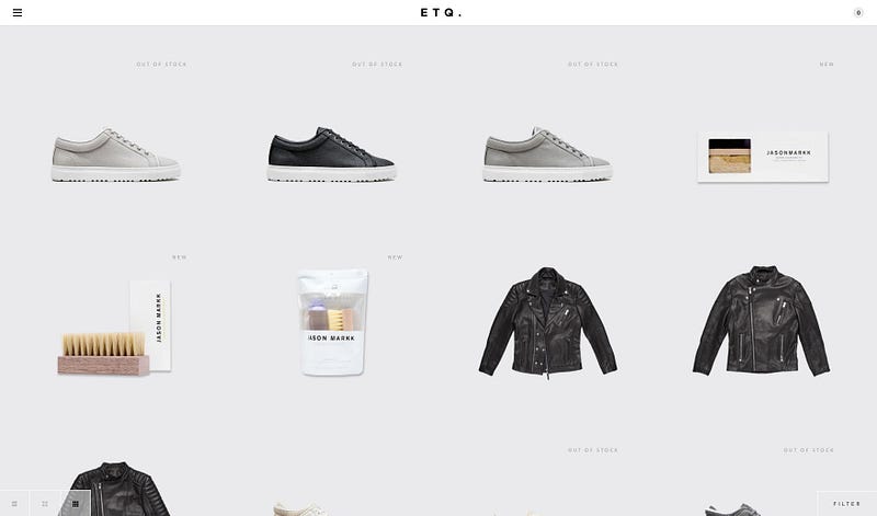
However, research has proven that demoting the main navigation into a drop-down menu reduces engagement, dwell time and even affect sales on both desktops and on mobile! It’s been reported that some mobile sites are now moving away from the hamburger menu in favour of a mini nav that is front & centre.
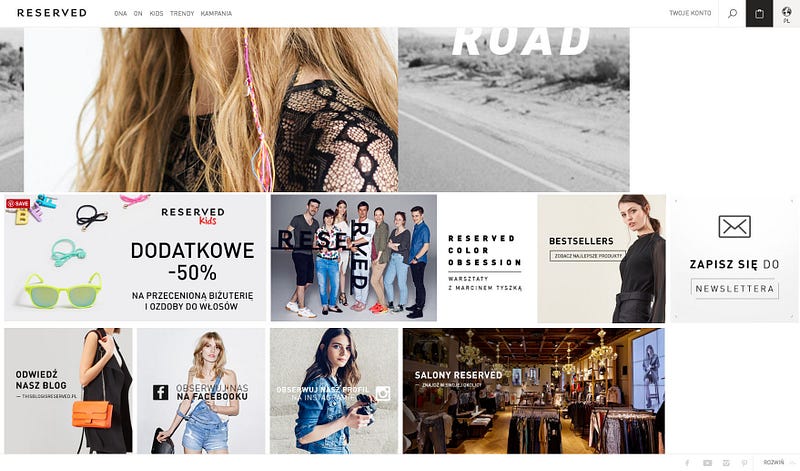
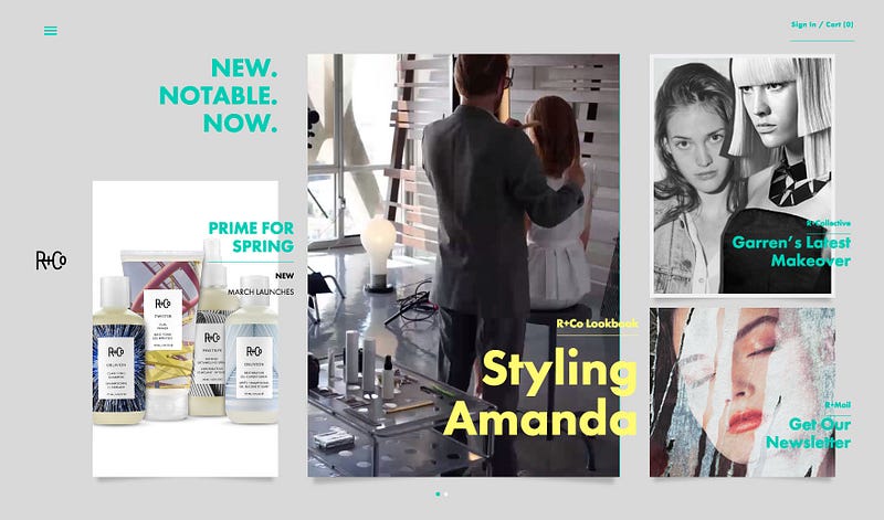
4. Cards
Cards are great for organising sections or products in a clutter-free and user-friendly way. They simplify navigation and improve UX, allowing users to easily access information at a glance and distinguish between topics.
The greatest benefit of adopting the cards layout is they work extremely well with responsive web design which is why they are very popular in e-commerce websites.
This has been implemented by Reserverd and R+Co to great effect.
5. Dynamic Searching
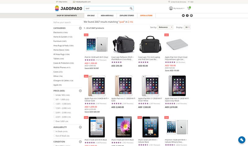
This year has seen the rise of the dynamic search feature on e-commerce sites using JavaScript and Ajax to display search results instantly. This is best implemented on sites with large inventories as it allows customers to browse your store quickly without loading every search result page separately.
This seamless search method differs from the likes of Google’s autocomplete. It displays suggested words and phrases based on trending or previous user searches and then requires the user to click to search.
Check out JadoPado.
These are just a handful of the most common design trends we’ve seen so far this year. Let us know your thoughts and what your most/least liked design trends of 2016 are below.
